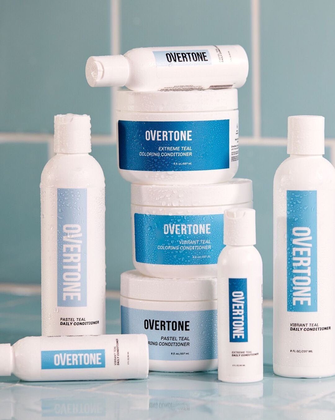
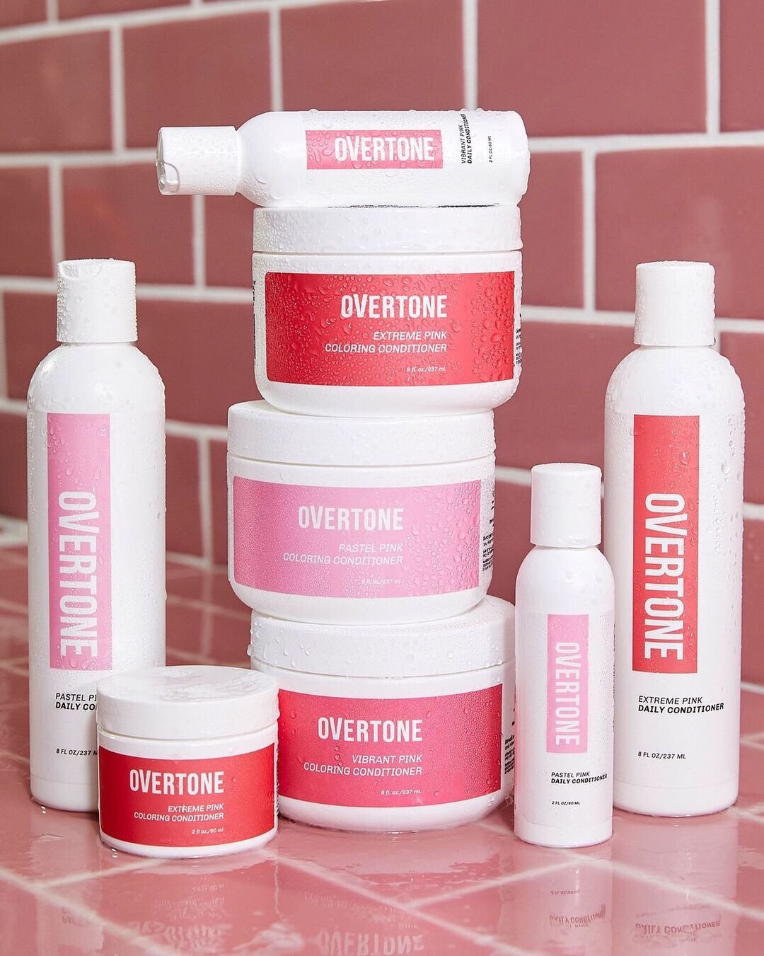
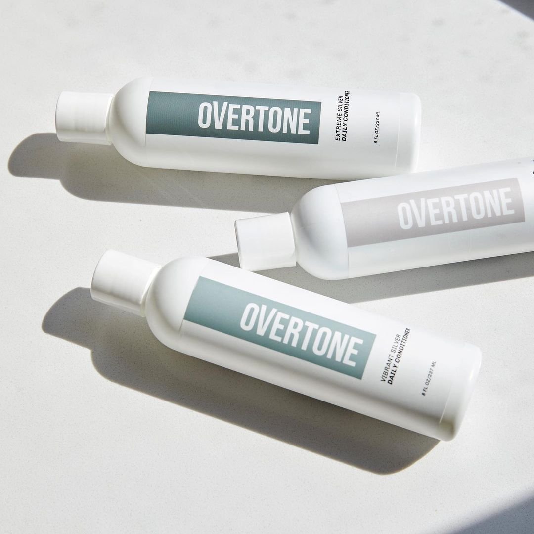
In late 2018, oVertone set to redesign their packaging to compete aesthetically on social media and provide a high-end experience if they decided to pursue retail.
Our product labels hadn’t been revisited in years, so with the founders, I got to work designing our new label, and in turn, where our brand would transition.
My work: Creative Direction, Design, Copywriting, and implementing across 120+ products.
In-Shower Accessibility.
In the months that followed, we began to imagine what our bottles looked like to many people across the spectrum of accessibility.
One of the most important things our labels needed to communicate were the color and which products you were squeezing out in-shower for people who are visually impaired in the shower and outside of it.
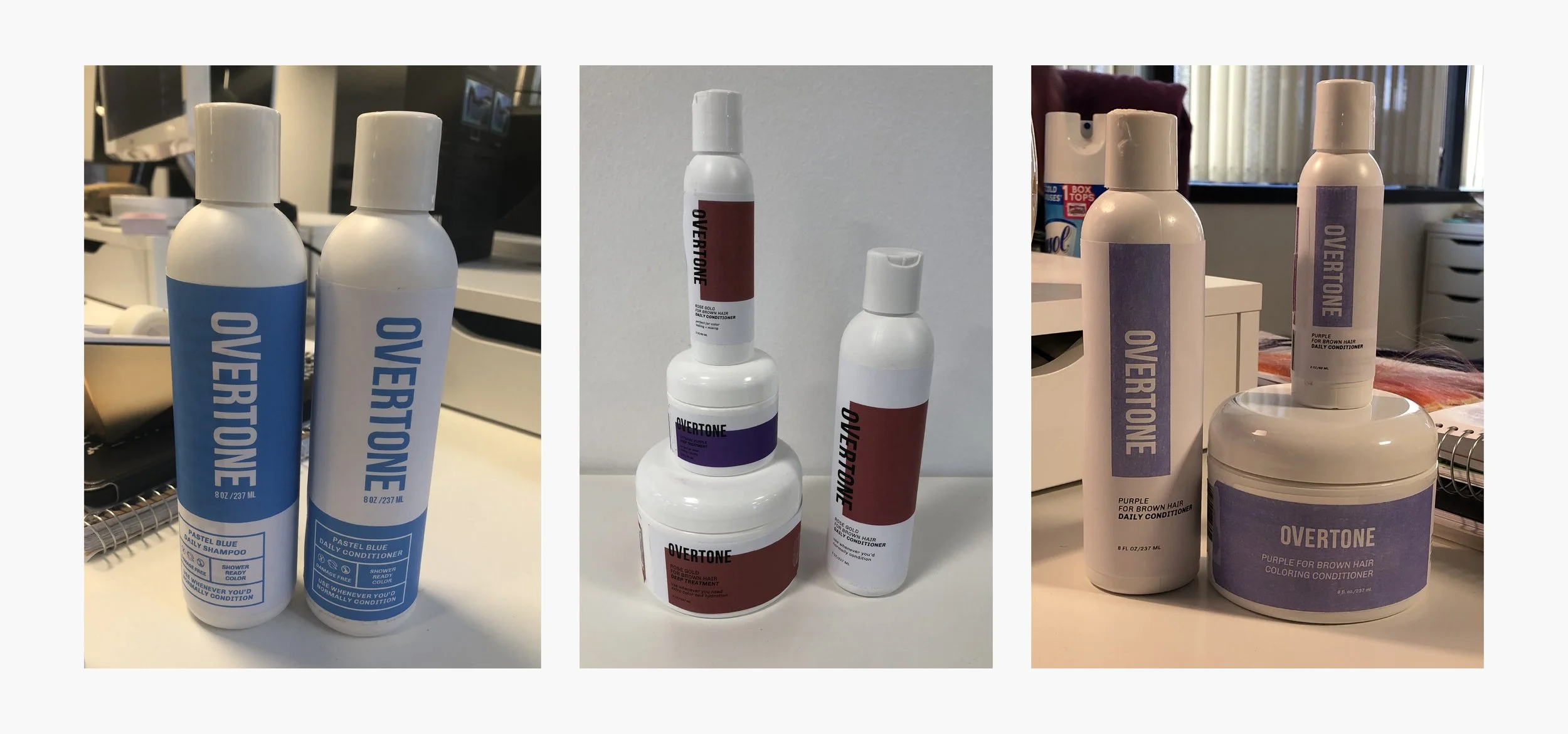

Label Roll-out
While we were making a hard transition online, to lessen waste, our new labels were going to be introduced once the existing inventory had been liquidated.
The team and I began hand-labeling empty components, until we had a full set to photograph and replace all our assets site-wide.